How people unmask passwords
Lately I have been reading some articles about the benefits of showing passwords in cleartext instead of masking them. All articles agree that masking password does not increase security, and has a very negative impact on the usability, in particular on mobile devices. Jakob Nielsen has published about the matter, and also Luke Wroblewski wrote two very interesting articles about the subject and illustrates them with some nice examples.
Nowadays, most websites and apps show therefore the password by default in cleartext or provide the possibility to unmask the characters. The toggling between the states is normally solved by proving some kind of link or icon in the right corner of the password field or having a dedicated checkbox near the field. These design patterns are usually well understood by the users, as the work of Jack Holmes shows.
My Experiment
I was curious to dig a little deeper into the subject and decided to run my own experiment. The goal was to better understand how people interact with such user interfaces. I created a small prototype of a login screen in Quant-UX. The users are supposed to enter an email (guest@guest.com), enter the password (e3C4DDF9555K) and click on a “Login” button. By default the password was masked, but the users could unmask the password by clicking on a “Show” link. Once, the user has entered the correct password and clicked the “Login” button, a success page would be shown. The interaction flow of the prototype is shown in the image below. ( Don’t forget to check out the making of video)
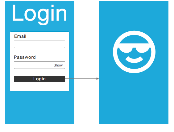 The UX flow of the prototype.
We asked 36 persons between 20 and 40 years to perform the test on an android smartphone. The credentials were shown to them on a paper, so they did not have to memorize the email and password.
Results
All of the 36 persons were able to enter the email and the correct password and to succeed to the second page. In average they took 50 seconds to complete the login process and 33 seconds to enter the correct password. 33 of these user were able to entered the correct password before clicking in the “Login” button the first time. The other 3 users unmasked the password and corrected it.
The first finding of this little experiment is, that the majority of the user unmasked the password. 27 users clicked on the “Show” link to see the characters in cleartext. These findings are inline with the articles mentioned above, and proof the usefulness and user acceptance of the unmasking option.
What really surprised me, was *WHEN* the testers decided to unmask the password. The first thing I do when I encounter a complicated password like “e3C4DDF9555K”, is to unmask the password if possible simply because I would like to avoid typos and I expected the testers to behave similar. But to my big surprise, only 3 of the users clicked on the “Show” button before they entered the password. The remaining 24 users unmasked the field after had entered at least one character the password.
Password Review
While performing the tests, I also observed another interaction pattern that really surprised me. 10 of the testers did a kind of review of the password. They entered the complete password correctly, but instead of pressing the “Login” button, they unmasked the password to check if it is correct, and only proceeded then.
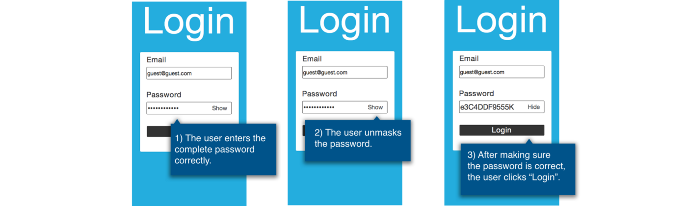 The password review pattern is performed by 10 of 36 users.
I can only guess, why the users did this. Most likely, they have experienced in other systems, that they have to retype the password after a failed login attempt. As the password is quite complex and takes some time to enter, the users try to avoid loosing it, by reviewing the password before pressing the “Login” button.